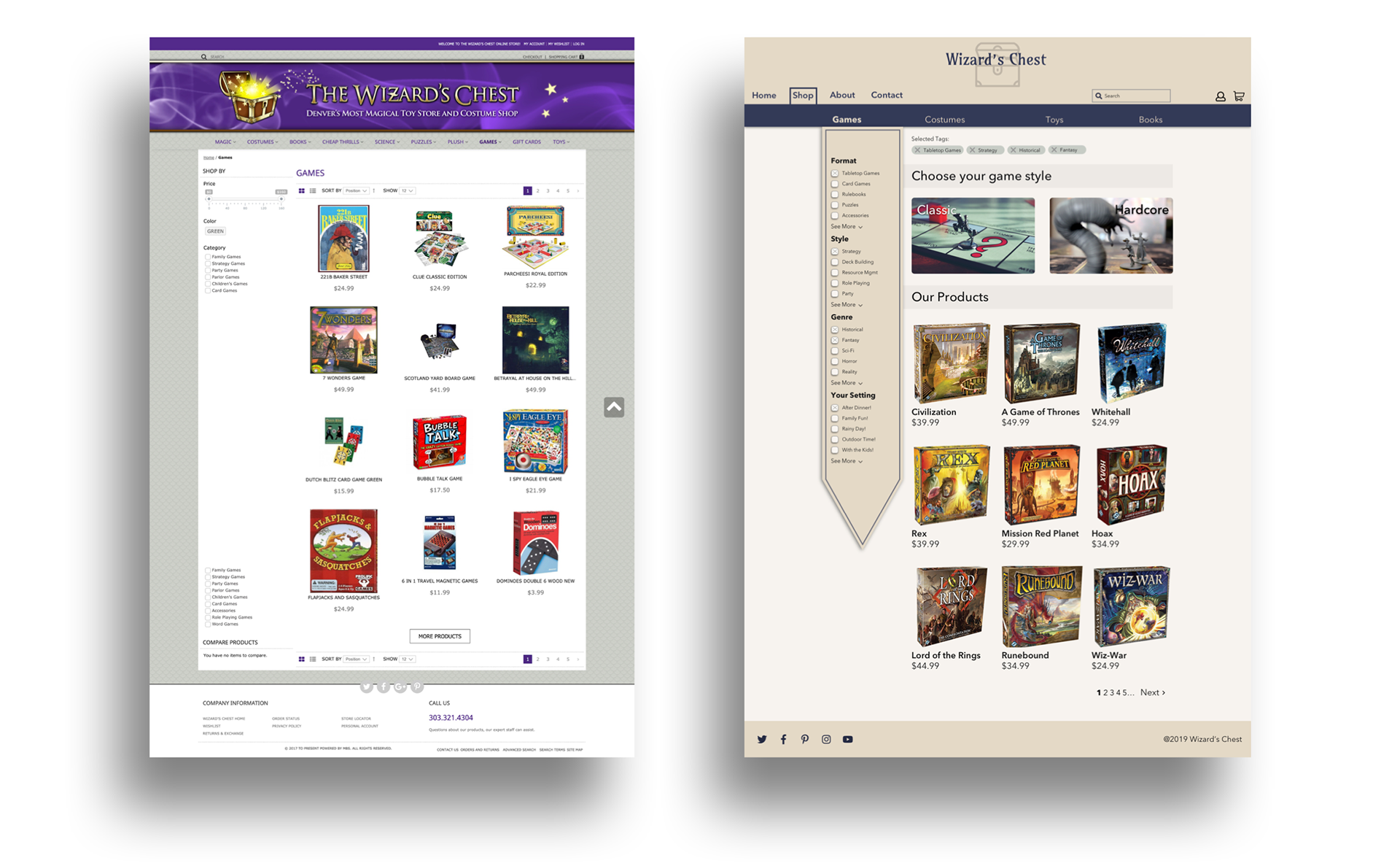
This was a two week project to conduct research as well as re-design an existing e-commerce website. I chose the notorious Wizard's Chest in Denver and created mid-fidelity mockups for both web and mobile.

Role
UX/UI Designer
Tools
Sketch, Invision, Zeplin, Principle
Duration
2 Weeks
A Treasure trove of research
I began my research by conducting usability testing of the current website to see what problems already existed. Users were frustrated that they couldn't access regular features like a search bar or settings. With a frequent response being "Can I just google for it?" User interviews and competitive analysis helped me deduce what to include as well as what not to include in the new Wizard's Chest site.
Users want fewer categories
Users want as much information on the product delivered clearly
Users are coming to Wizard's Chest with varying degrees of knowledge about the products
Information Architecture - Using Tags
I was having difficulty determining how I could use categories to help users navigate the complicated information architecture. I had 6 individuals do some card sorting of various games and accessories. Unfortunately, these results weren't consistent enough to develop a clear system.
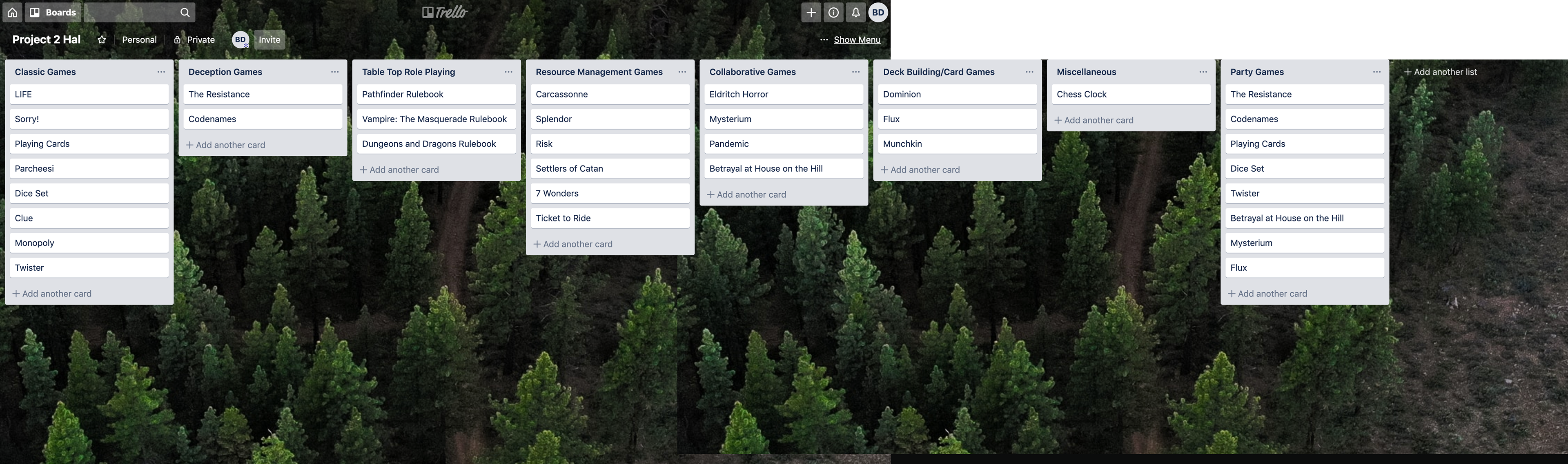
A card sort from my research
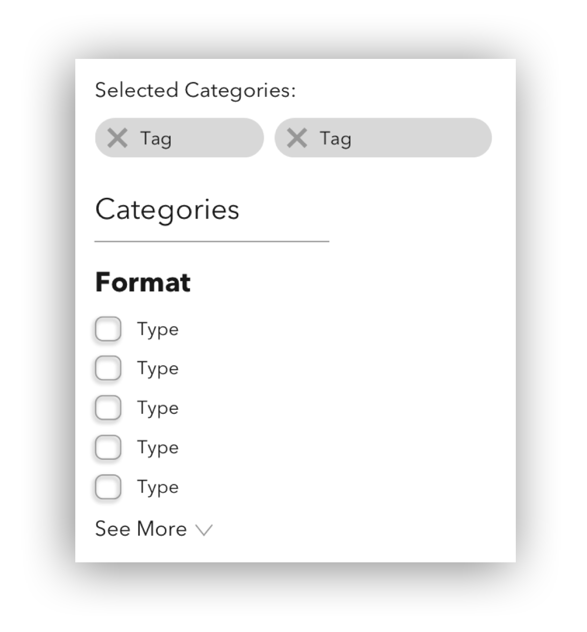
I then realized that I could almost eliminate categories altogether and use a tag based system utilizing both quantitative as well as more abstract criteria. I would then have two guiding "categories" of Classic and Hardcore to guide the novice or power user. From there, shoppers could populate tags or utilize a clearly defined search function.
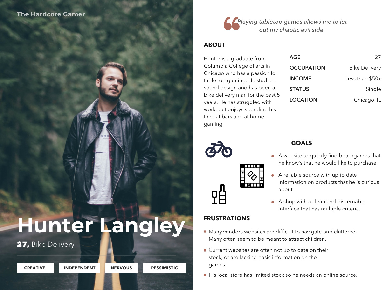
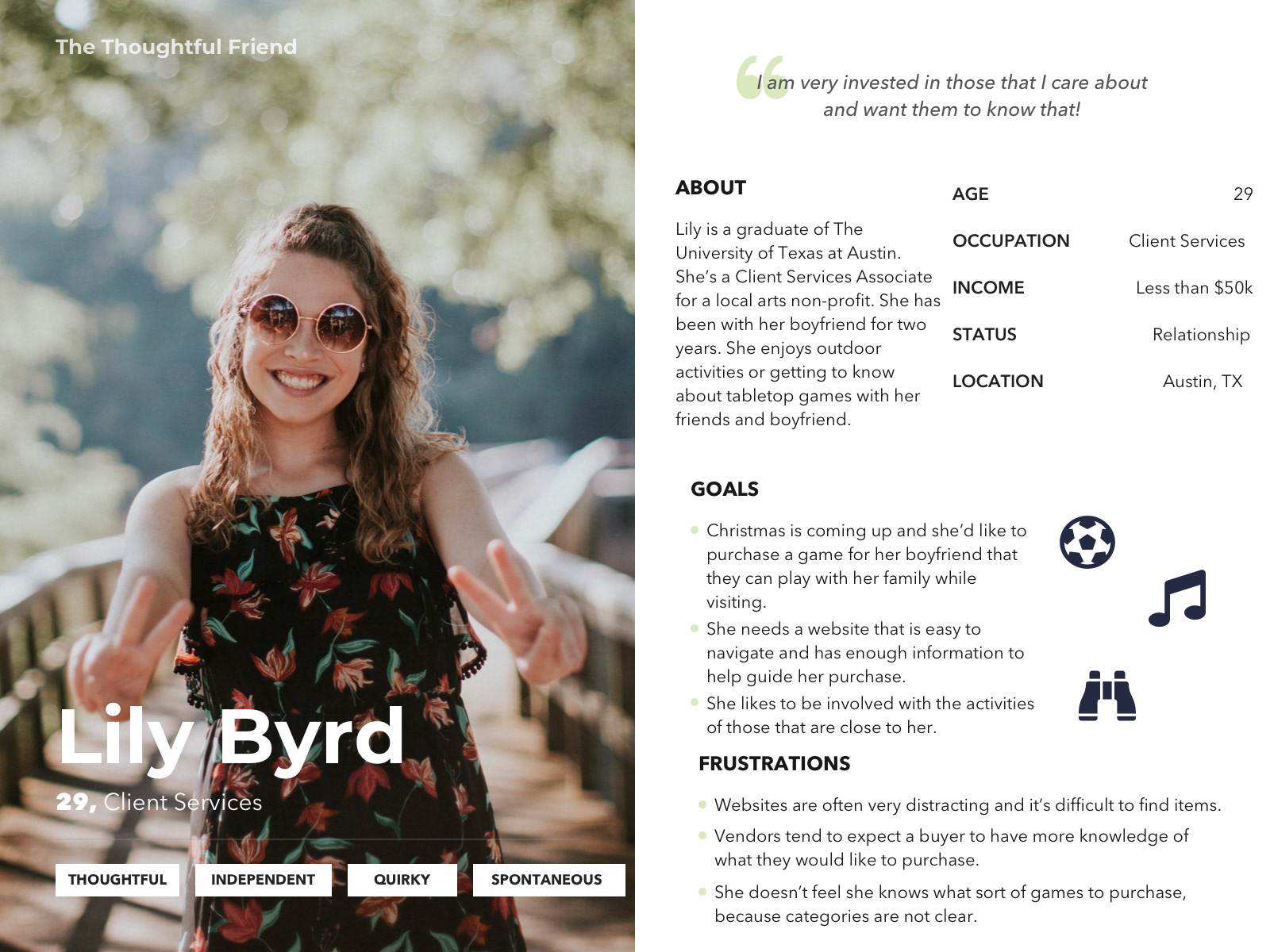
The Players
To create a realistic experience, I had to form two distinct users of the website. Hunter would be familiar with the landscape of boardgames and know what they would like to purchase. Whereas Lily was less familiar and would be looking for the right game to purchase for a significant person in her life.
User Flows
Hunter and Lily need an e-commerce solution to purchase tabletop games and accessories, because they possess varying degrees of knowledge on these specialized items and want to make the right purchasing decisions. User flows were developed to demonstrate how they could use search and tag functions within the site:

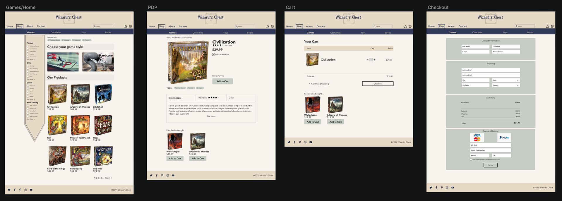
Low Fidelity
At this point I was able to move into the design phase. I began by making paper sketches and was able to quickly move into digital.

Mid-Hi Fidelity
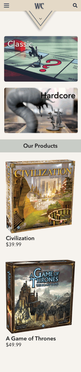
Mobile

Animation using Principle
I used Principle to animate the mobile "flag tag" that would drop to display the tag selection system. The hamburger menu would show settings and account information.
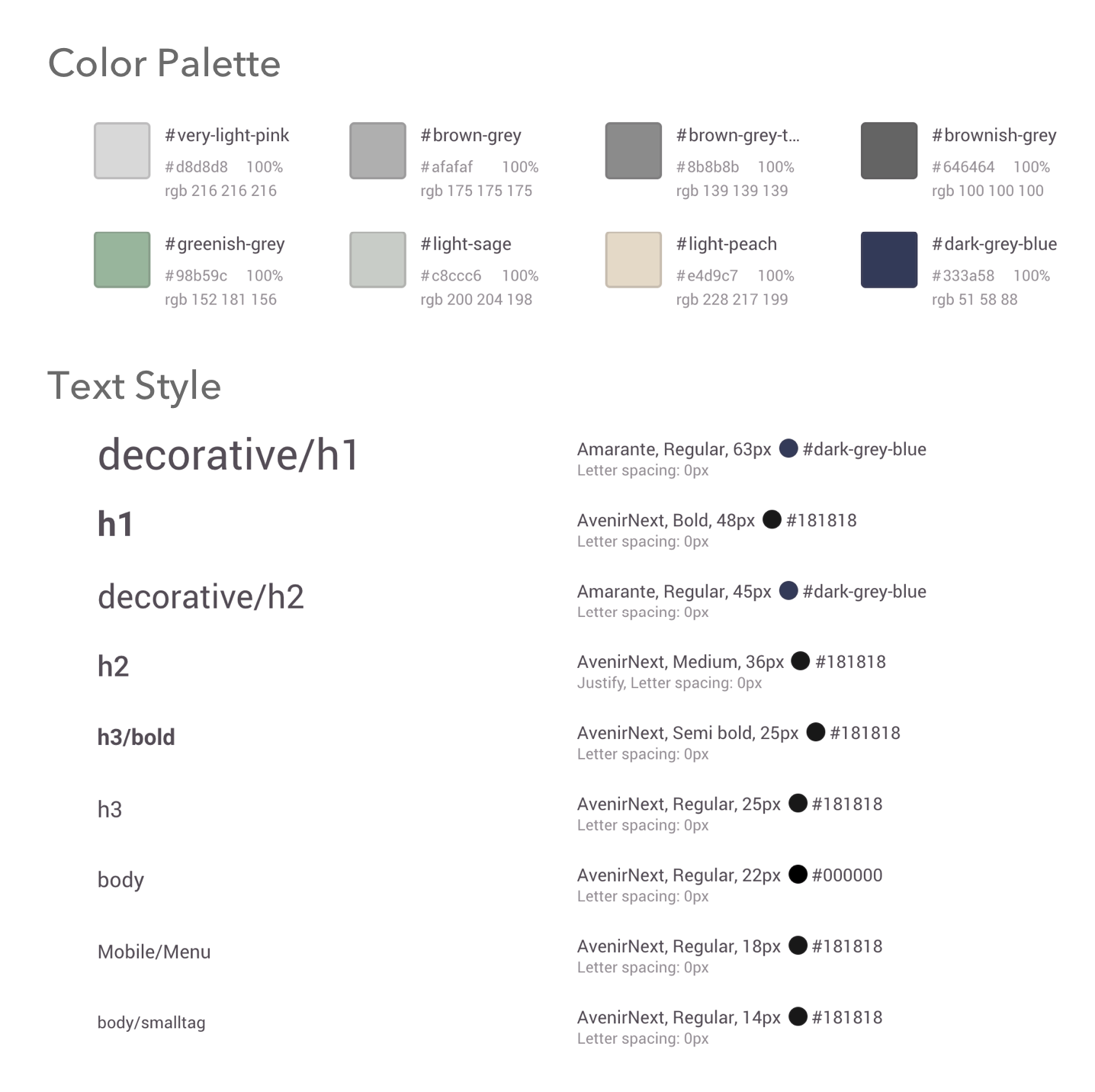
Style Guide
I used Zeplin to create a style guide for the site. My color choice was based off of the purple and gold from the original site, but toned down for a more clean "adult" look.
Closing the Chest
This was a really fun project! But, as is common there were a lot of things that I could have done differently.
Color palette: I was happy with the general direction of the colors used, but they feel a little dead. I would change the colors to be more vibrant.
Layout: The layout needs some work. It's not the most modern "feeling" website. Some great advice that I received was that "It looks great, but it looks about 7 years old!" So, enjoy a retro Wizard's Chest!
