Houseparty + Epic Games Merger
In June 2019, game developer Epic Games acquired video chat app Houseparty. The hugely popular video game developer behind Fortnite believes that “by teaming up, we can build even more fun, shared experiences than what could be achieved alone.” Why did Epic buy Houseparty? This was the question that me and three other designers at General Assembly had two weeks to come up with an answer to.
Duration
2 weeks
Tools
Sketch, Craft, Principle
The Team (pictured to left, clockwise from top left)
Maria Laly, Ben Dougherty, Matt Czencz, Candace Yeh
Maria Laly, Ben Dougherty, Matt Czencz, Candace Yeh
Our goal was to create a concept for a mobile application that could fulfill Epic Games vision when purchasing Houseparty. We had to imagine ourselves working for these companies and not only redesign the essential functions of the video chat, but combine them with the ability to interact with gamers through streams.
Combining two business models
Houseparty's roughly 2 million users were primarily teens or in their twenties. Epic Games boasts 100 million users and can also admit to a dominant demographic in that age range. A merger seems intuitive on that basis, but how would we combine video chat features with mobile gaming and streaming? We had to start looking at existing examples.

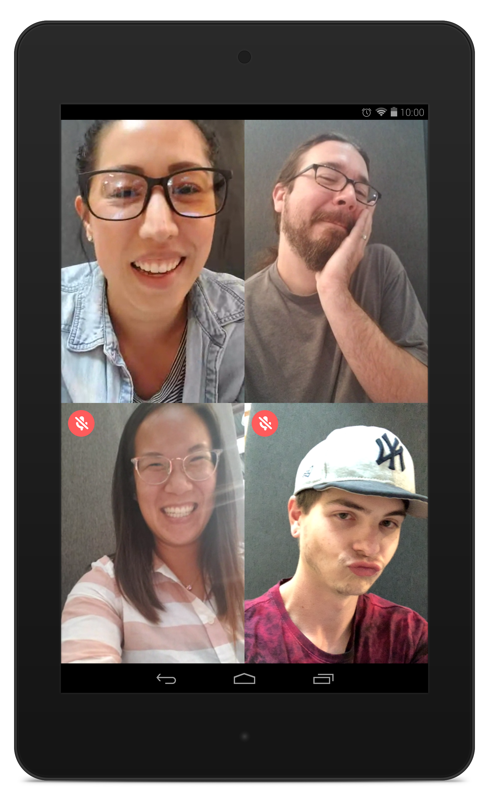
For video chat apps we took a look at Google's Duo/Hangouts, Skype, Facetime and Snapchat. We found that there is a vast array of experiences between these apps but reviews indicate users prefer simpler interfaces, they want control over how they interact and whether they are seen on video. Also, being available on one operating system was seen as a hindrance.
We found the users primary enjoyment came from the interaction between the players and the viewers - that feeling of playing a game with a group of friends in your living room.
When using Houseparty ourselves, we found the interface to be cluttered and confusing. Our research into competing products indicated that was something we would need to resolve. At this point we had some good insight into what products people were using, now we needed to know who used them.
Who are our current users?
To get some insight into our current users we sent out two surveys through Google Forms. A general video chat survey was sent out that mostly informed us of preferred usage.

Putting it all together
At this point, we had some good insights from competitive analysis, user surveys and a few user interviews. Therefore, we could start prioritizing our features.
“I would like to control my video and audio settings”
“I would like to chat with users of both Apple and Android devices”
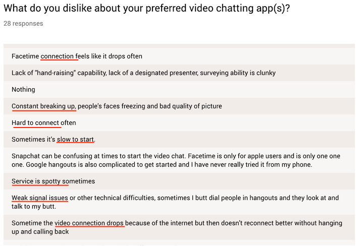
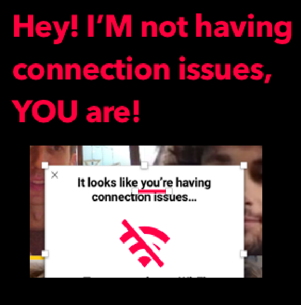
“I have connection issues when video chatting”
“I would like to chat with users of both Apple and Android devices”
“I have connection issues when video chatting”
“I would like to interact in my video chat while viewing a streamer”
“I would like to easily add people or join when video chatting”
“I would like to play games when video chatting”
“I would like to easily add people or join when video chatting”
“I would like to play games when video chatting”
We started to conceive of the wide array of people that could use this app. They might want to maintain just the chat functionality, or they may want to take advantage of the gaming and streaming options.
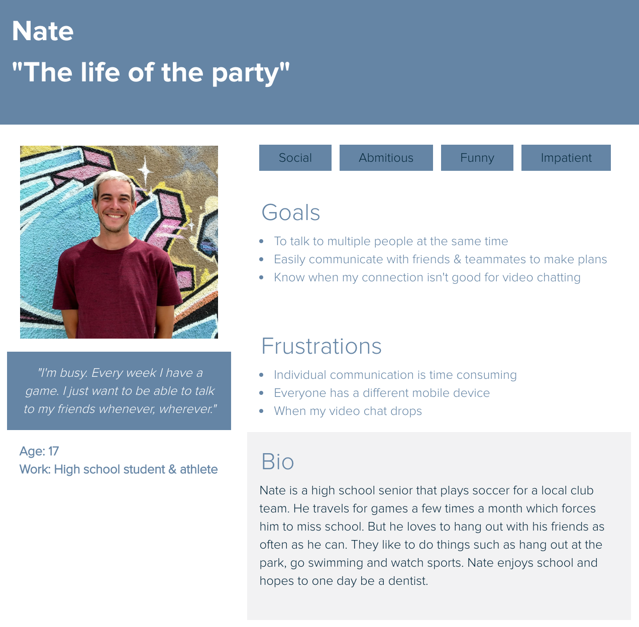
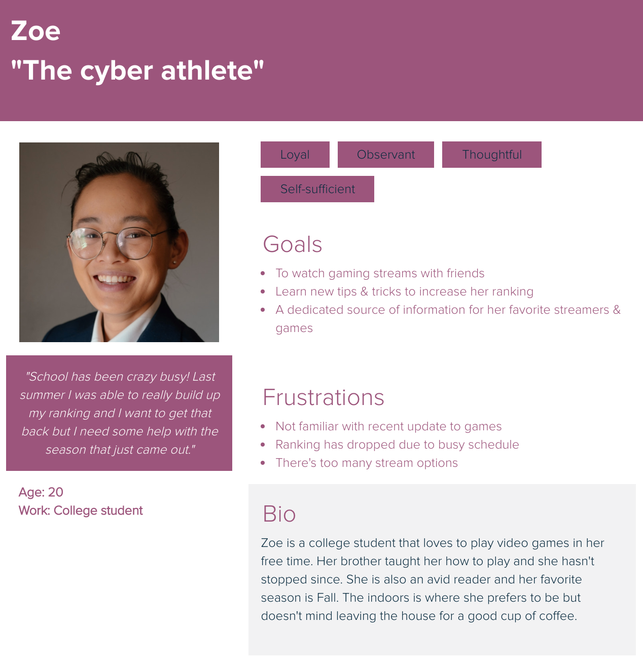
Introducing our Personas, Nate and Zoe:
We had to not only form personas, but they had to be real people! For our product to feel real, we needed people that we knew who could take realistic "video chat" photos for us. Thank you to Joe and Dani for being such wonderful volunteers!
Nate would demonstrate just the video chat aspects of the app by having a conference call with his teammates about an upcoming game. Zoe would be digging into the gaming features by messaging with a friend who recommends a stream that they watch.

Sketching out the basics
Before we started to ideate, we had to decide which design standard to use, iOS HIG or Material Design. We decided to work with Material design in mind, understanding that the clean interface would complement the sleek gaming feel of the app. Real estate was also a concern, so to open things up we decided to design for a 9” tablet to be less constrained by size.

We needed a homepage that would easily navigate to a video chat or to a gaming portal. Would this homepage immediately display a camera feed, like most chat apps, or would it have a blank background? This was a point of contention - does everyone want to immediately see themselves when opening the app? We met in the middle and it was agreed that it would display a blurred camera feed with a logo.
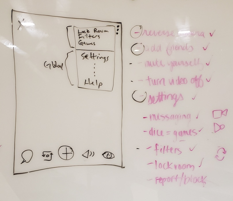
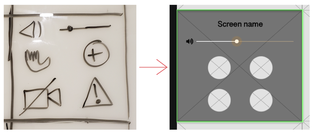
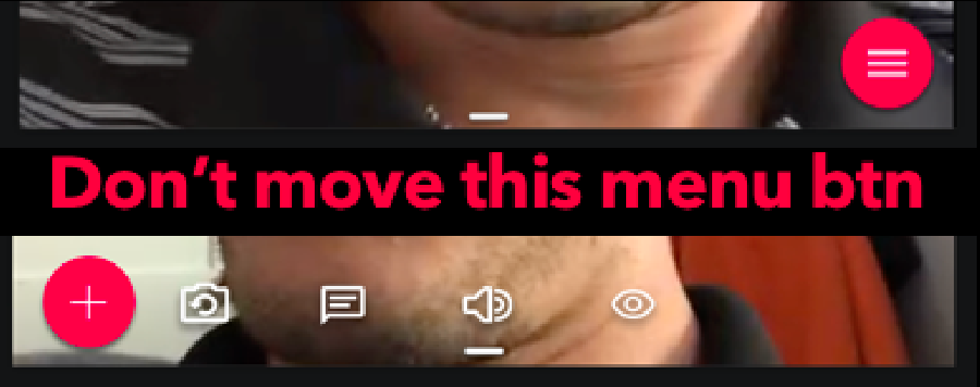
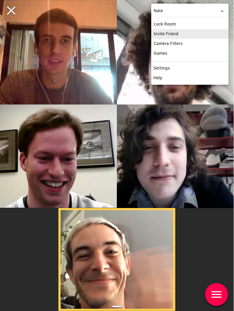
Our video chat screen needed to possess the functionality of other programs, without the excess that we experienced in Houseparty. We decided to create a menu icon that, when engaged, would roll out the main functions:
Add person to chat
Reverse Camera
Go to messaging
Personal audio control
Personal video control
Reverse Camera
Go to messaging
Personal audio control
Personal video control
Users should to be able to easily access settings for other people in a chat to control their volume, report them or turn off their video feed. There was some debate as to why you may want to turn down or mute someone in a chat. But, since this was going to be used for watching game streams, we wanted users to be able to turn down someone with excess background noise.
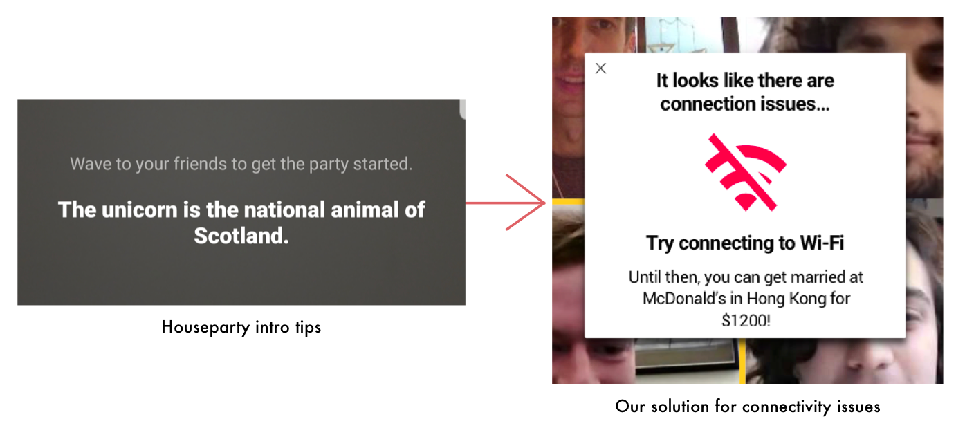
We had to address one of the biggest concerns that we had gathered from our research - connectivity. While there was little that could be done about the users connection, we could do our best to make their experience better. We would notify them of connectivity issues, give a tip to resolve the issue and follow it with a quirky fact. Houseparty had short odd bits of information like this on their chat screen, so we thought it would bring cohesion in our version.
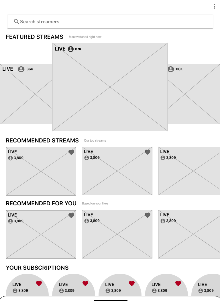
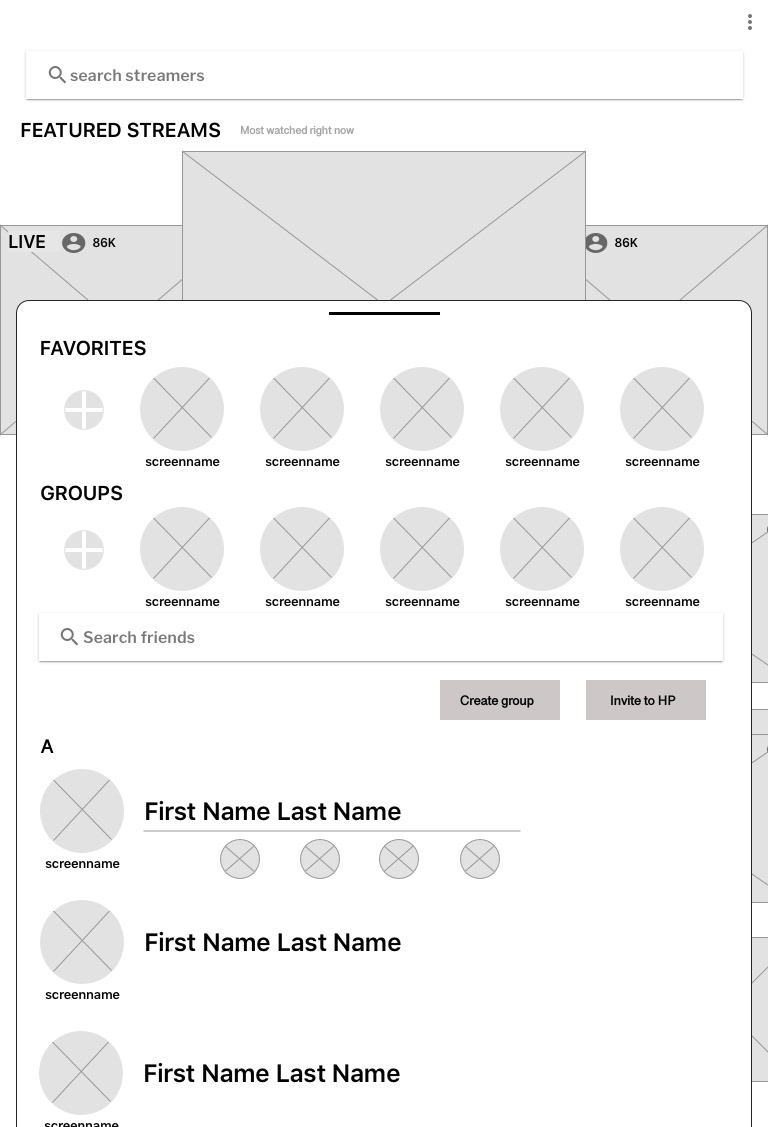
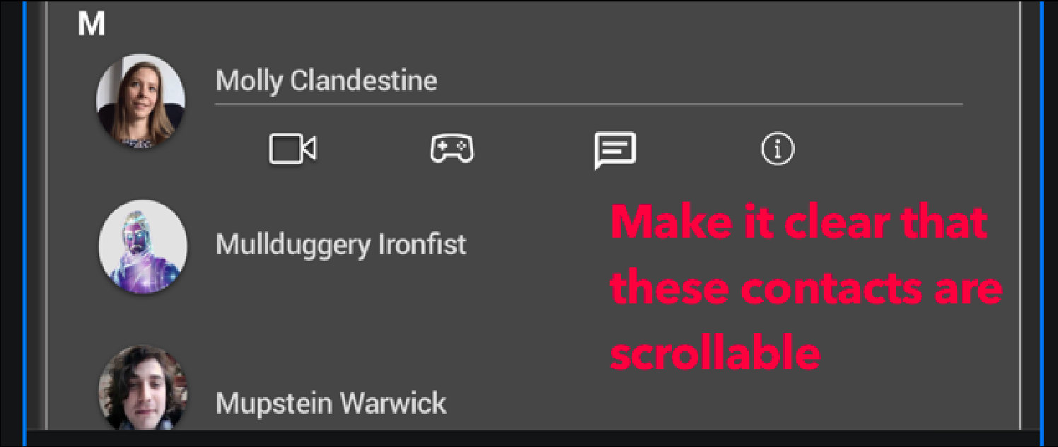
We proceeded with developing a contacts page that would feel familiar and allow quick access to information on friends throughout the app. Users could access from any screen by swiping up from the bottom or through the kebab menu. A gaming portal would provide information on streamers with access to multiple categories. The portal would also allow players to select which Epic mobile game they would like to play or stream. Streaming functions should then integrate all previous video chat and message elements.
Building our Mockup
It was time to convert these ideas into wireframes. Candace worked over a weekend on shaping our drawings into something more tangible in Sketch. The results were fantastic and we worked together to make just a few tweaks.
Home
Video Chat
Gaming Portal
Contacts
Messaging
Stream
Maria got to work on making changes to the wireframes. I then worked on accumulating a design system with icons and document colors that would combine branding from both Epic Games and Houseparty. I also needed branding icons and a wealth of screenshots of people using video chat as well as video game streams.
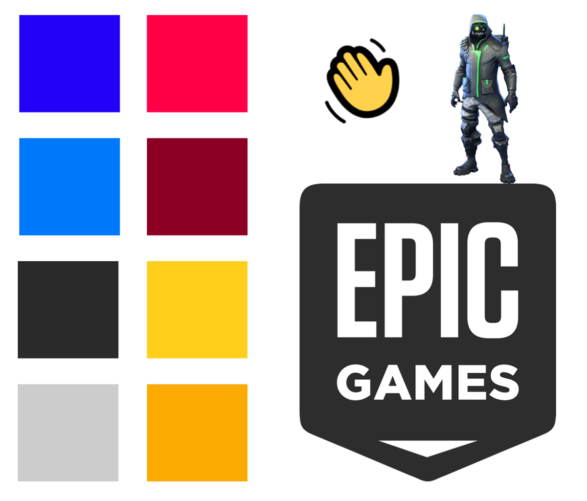
We used existing branding to develop a design system.
At this point I took over the Sketch file to translate it into a more mid to hi fidelity mockup. Feeling confident that I could just plug and play icons and symbols into the wireframes, I ended up being disappointed that was not the case. Candace’s wireframes were great, but jumping into someone else’s workflow proved to be more daunting than anticipated.
After spending time with it and getting some help from Candace, we started making progress in populating the file with elements to make it feel like a living app. This was my first time doing UI work in a higher fidelity and I certainly had some struggles. Fortunately, color and font choices were already made based on those already used by the two companies.

The video chat elements came together pretty quickly and we had developed our menu button that would “drag” out icons for primary functions.
The gaming portal screen was going to prove a challenge. With so much activity from the images of games and players, I had to make sure that there was enough space to not overwhelm.

While we were making great progress, we still had to breathe life into some elements. These subscription characters fit the branding, but seemed bland on this background.
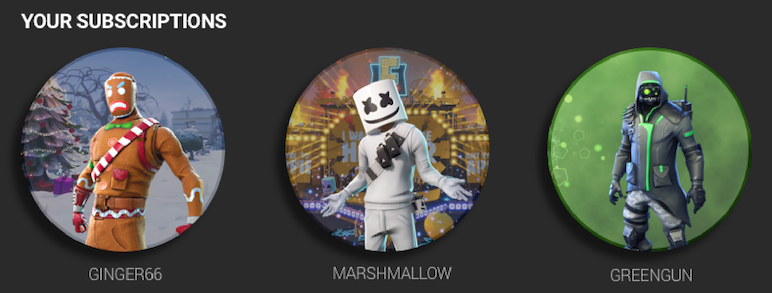
We decided to pull in actual game scenes behind and add them in for more character, which worked wonders! This thing was starting to look like a real app, it was time to test it out.
Testing our Prototype
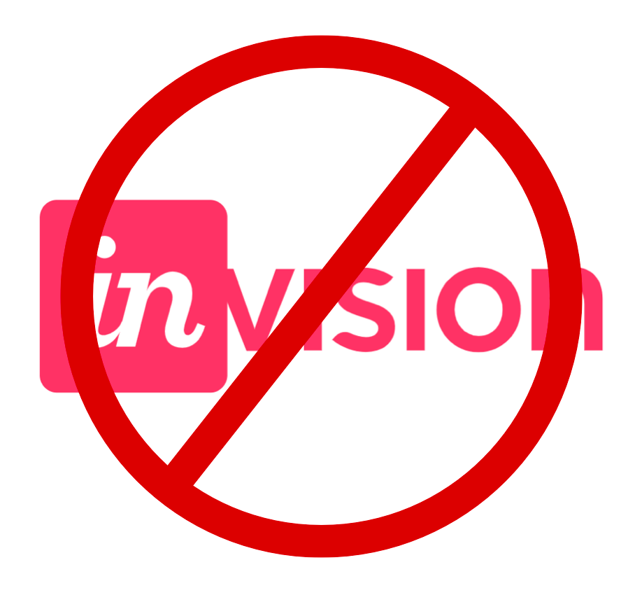
When we went to load the prototype in InVision everything looked good except a glaring one inch block of space at the bottom of every screen! Come to find out, they can prototype for 7 and 10 inch screens, not the 9 inch that we had designed for. Live and learn…
In the end, we have multiple tools at our disposal so we found that the Craft plugin worked just fine for what we needed. I set up a prototype and tested out our user flows on a handful of folks.
Gamers and non gamers alike found the interface intuitive. They found it easy to navigate directly to a video chat or move into the gaming portal. However, there were a few changes we needed to make.
How does our video chat hold up?
We had to develop flows that would demonstrate all aspects of the app that we had developed. We wanted to start with Nate who would have a video conference call to discuss an upcoming soccer game with five of his teammates.
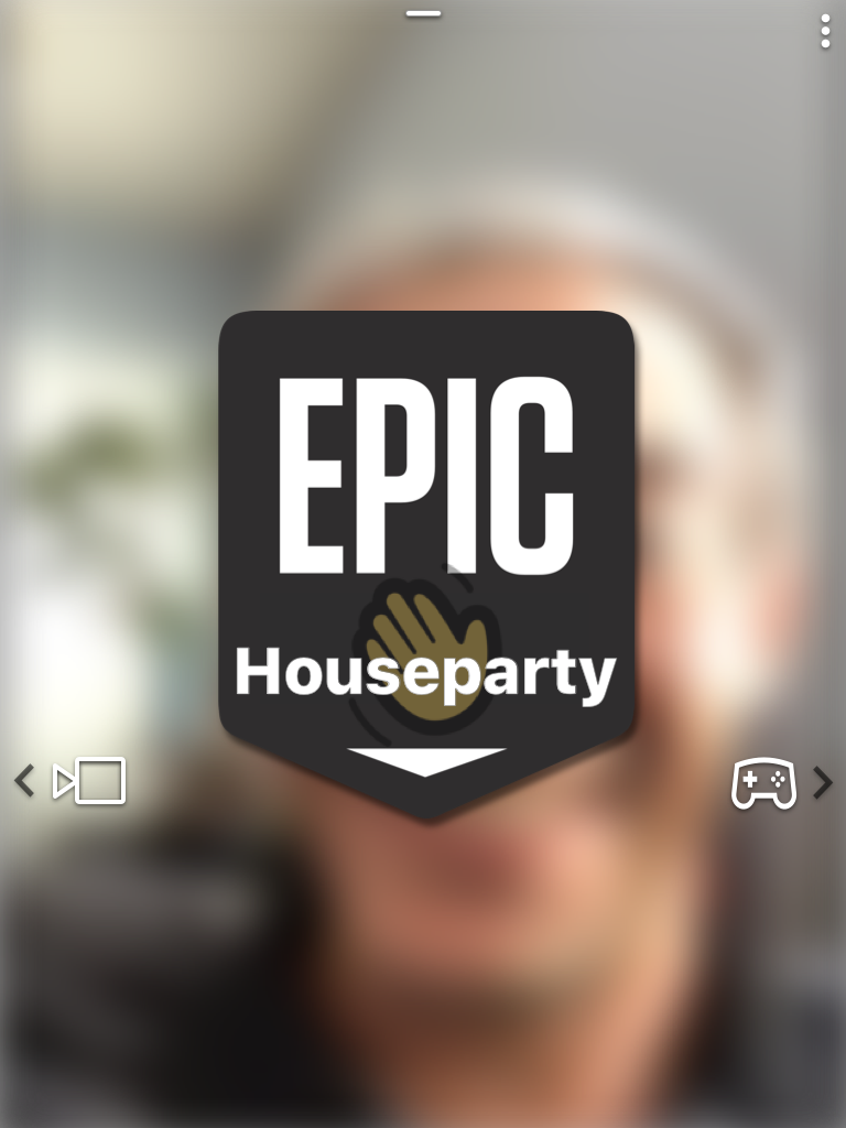

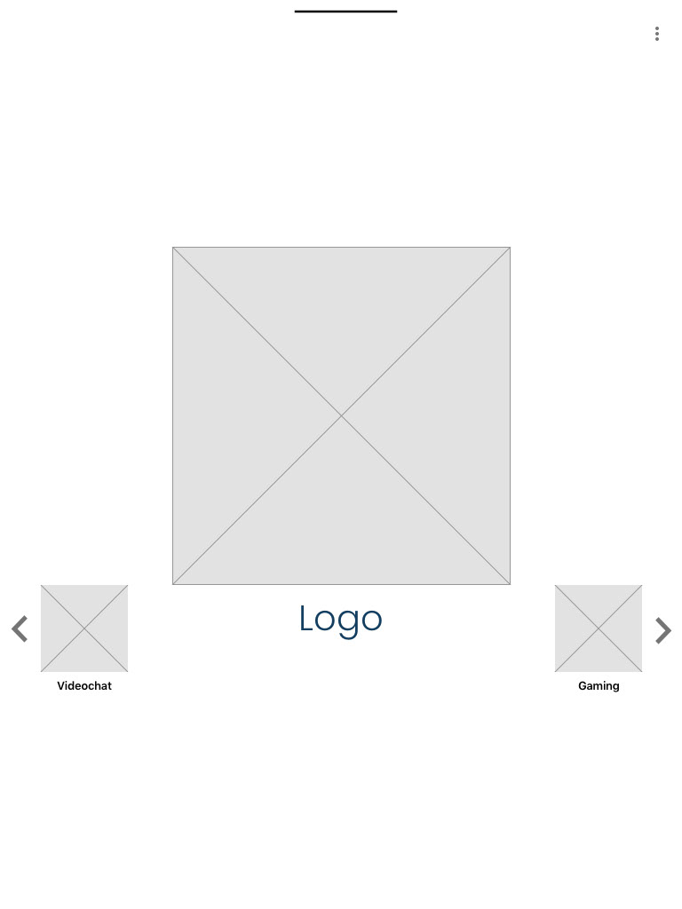
Nate would start out on the home screen with the logo featured in the center and a blurred image of his video feed. He could then swipe directly to a video chat or the gaming section of the app.
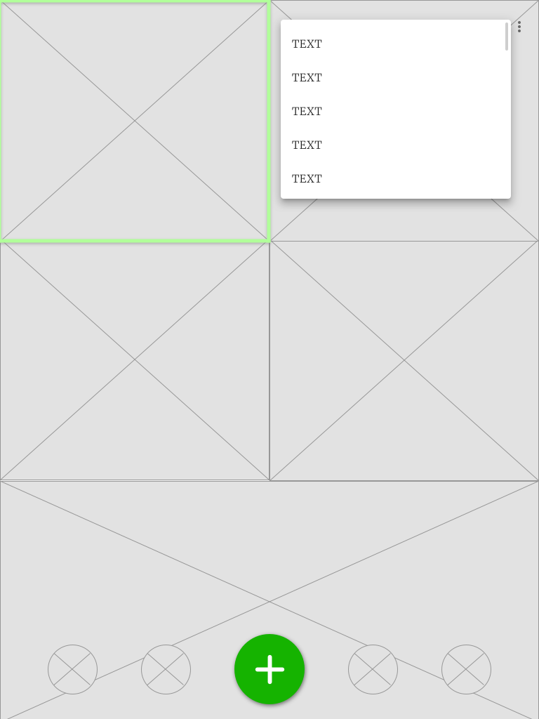
Any user could access the contacts card by pulling up on the pill button located bottom center. The large red button at bottom right could be tapped or dragged out to access further video chat functions. Let's see how that looks.
Any user could access the contacts card by pulling up on the pill button located bottom center. The large red button at bottom right could be tapped or dragged out to access further video chat functions. Let's see how that looks.

We wanted to demonstrate the interactivity that the app could have, so we used Principle to create some animations of key features. Matt had some experience with animation, so he took this part on and did a great job. The red menu button turns into a plus, to add more contacts. Let's add some more people to the chat!
As more people are added to the chat, the real estate automatically makes room allowing up to eight individuals participate. We wanted to show that our kebab menu at the top right would house global settings as well as replicate some features from the menu button. We added a highlighted frame to indicate which user is speaking. But what if someone is speaking over you or you'd like to change their volume?

As deduced by our research, we wanted to include a way for users to control how they interact with one another. After long pressing on another chatters frame, their image would flip over to reveal functions to control their volume, turn off their image, "wave", as well as add or block them.
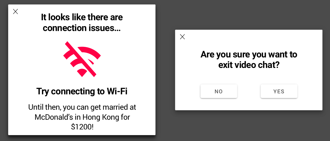
To end things off on the right foot for Nate, we wanted to make sure to include a way to alleviate connectivity issues. Again, we couldn't control connectivity through the app, but we could make the experience a little better. In order for Nate to feel confident that he was leaving a video chat and not accidentally continuing to send a feed, we included a feedback box to ensure the user knew that they were exiting.
What about gaming and streaming?
After Nate demonstrated the primary video chat functions, we wanted Zoe to explore more of the gaming and streaming options. She plays Fortnite regularly, but with college keeping her busy, she hasn't had as much time. She decides to hop on the app and get in touch with a friend to recommend a popular streamer to watch together.
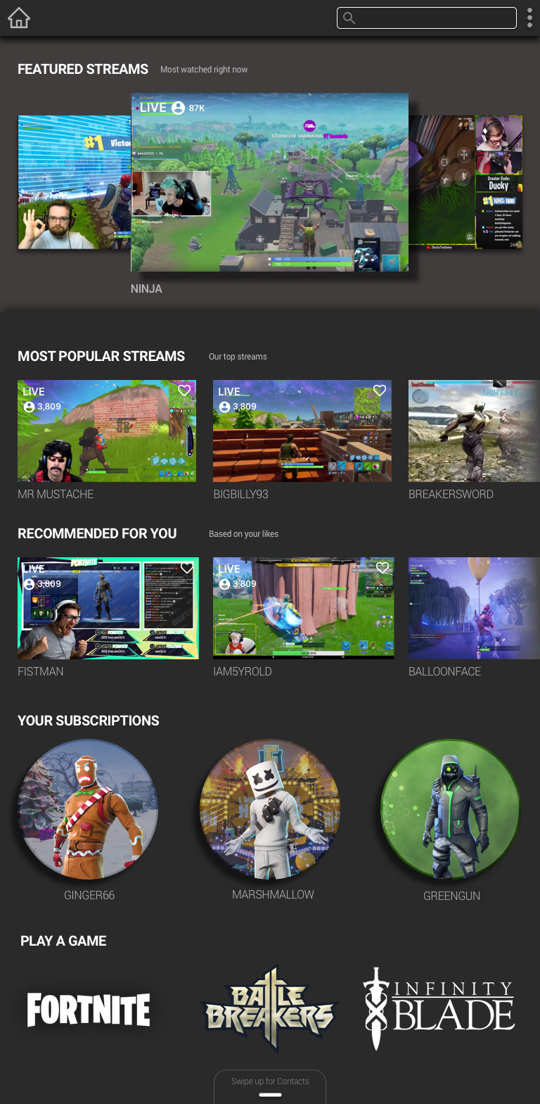
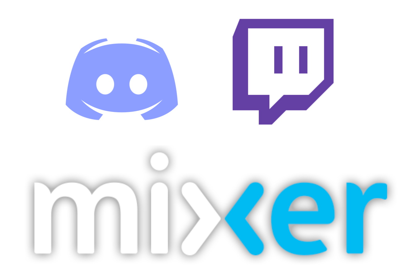
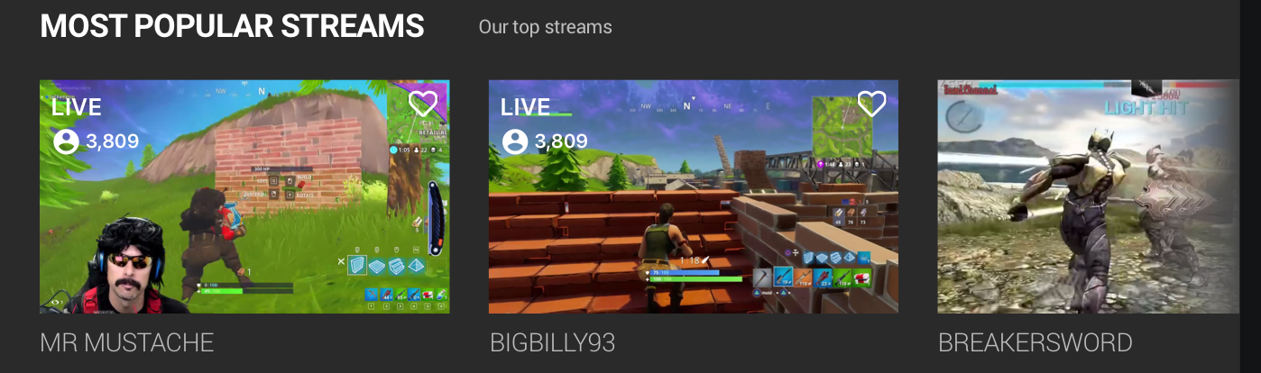
Considering that we could only speculate as to why Epic Games purchased Houseparty and didn't know exactly where to start with games integration we had to look to our existing examples. We used Mixer and Twitch as templates to build our gaming home screen that would allow access to streamers as well as games to play. Zoe wants to access her contacts so she's going to swipe the ever-present pill button up...
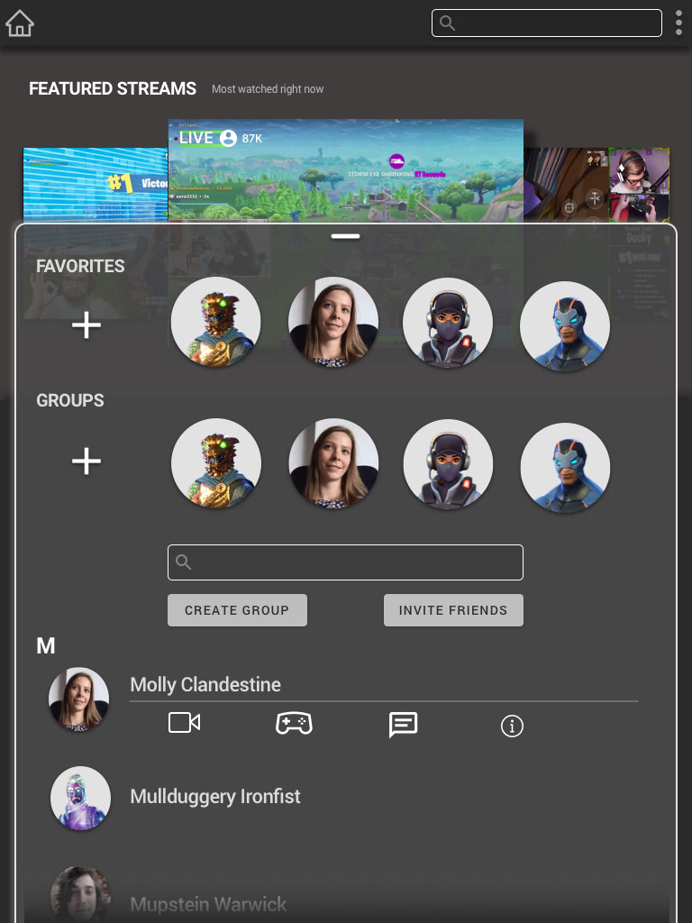
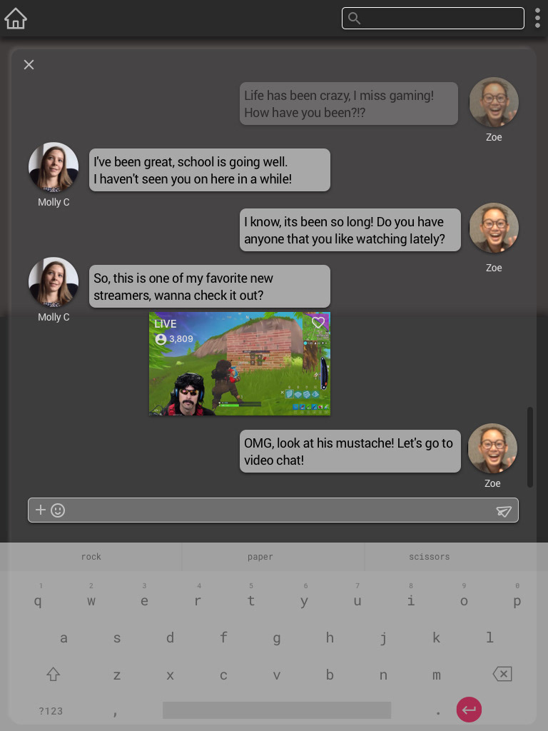
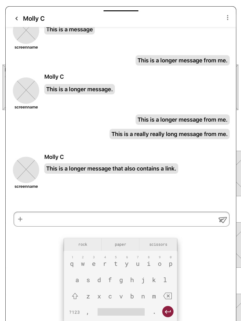
Contacts are listed alphabetically and are scrollable. They may feature a friends personal image or an "avatar" that they've selected. We wanted users to be able to quickly access a video chat, game or text message with other users. This is displayed below her friend Molly's name, so after tapping the messaging icon, they enter a chat. Molly recommends a new streamer that they proceed to both view.
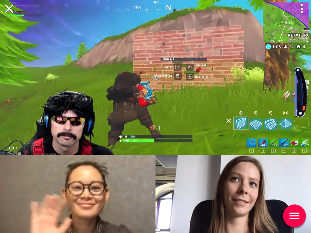
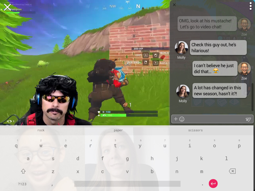
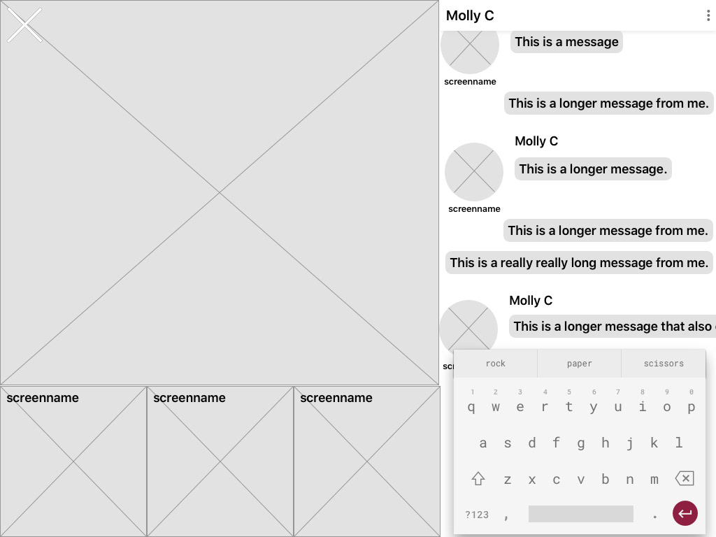
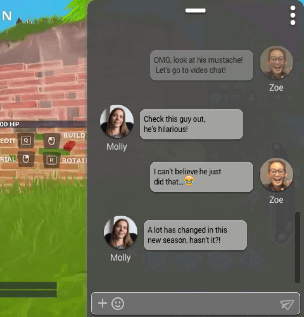
At this point, we decided to transition to a landscape view to demonstrate the customization available to the real estate. All of these views would be available in both landscape as well as portrait mode. Zoe and Moly are viewing the streamer and decide to do some messaging back and forth as well. Here they can send messages, emoji's as well as "rallies" or celebrations that are sort of animations that the streamer would also see, allowing for further interactivity between players and viewers.
Reflections and Next Steps
With the smiley faces floating over our last screen we felt confident that we had addressed some of the central issues when combining these two formats. We presented our concept to a generally positive reception, but we knew there was still so much that we could have done. The UI could have been cleaned up quite a bit. There was still more room for white space to separate elements and our slide up windows could darkened to bring more into focus. We had met our goal and used Material design in our prototype. However, we could have done more testing during our design to learn more throughout our iterations.
Our next steps would be to build out the gaming and streaming features. We would have liked to include player and streamer subscription services that would allow for loyalty points and payment options. We would also have features like maps and tips for particular games. A major step would be to figure out how to cram this thing into the real estate of a phone!
Overall, the four of us felt good after this challenging but exciting project. As Houseparty CEO stated in the press release for the acquisition, we felt that we addressed both companies “common vision to make human interaction easier and more enjoyable, and always with respect for user privacy.” Our concept might not be far from what the two companies are hoping to achieve!